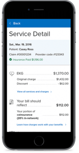
“Of course, our organization is focused on mobile” is likely your initial reaction.
But are you, really?
Why mobile-first matters, and what it really means?
At Paragon, we argue that designing mobile-first is not only unavoidable, but it offers great customer experience value. Here’s why:
- Global mobile usage has surpassed desktop usage: Mobile accounts for approximately half of web traffic worldwide. In the fourth quarter of 2019, mobile devices (excluding tablets) generated 52.6 percent of global website traffic, consistently hovering around the 50 percent mark since the beginning of 2017.1
- Mobile is the “platform of choice” for many categories: Mobile traffic dwarfs desktop on food & drink, pets & animals, and health (all over 70% mobile share vs. desktop in 2019) as well as community & society, sports and lifestyle – with a notable shift toward mobile preference to search categories such as vehicle sites, travel, reference, finance and others.2
- Most online Google searches start on mobile, not desktop: In 2019, 63% of Google’s US organic search traffic was initiated on a mobile device.3
- Consumers use mobile devices to compare products while in stores. With the increasing prevalence of online shopping and multi-channel retailers, 36% of shoppers worldwide reported to using their smartphones to compare prices while browsing through a retailer’s shop.3
Being mobile-first is about more than just designing on mobile – it’s changing your organization’s behavior when it comes to digital products. That means, when you’re evaluating your digital properties, you start on mobile. And that’s not just projecting a mobile screen on a large wall to view. That’s cheating. It mean’s testing on your actual handheld smartphone device. The problem is that we’ve been evaluating on desktop for decades, and we’re good at it. We know what to look for. It’s comfortable. But marketers need to step outside of their comfort zone and examine their digital products on mobile first – after all, consumers are.
It’s not just that customers are more heavily using mobile. It’s about how they use it.
Being customer-centric means understanding their preferences and behaviors. The reality is that users will interface with your mobile and web properties in different ways – if you’re not recognizing and designing for this, you’re missing out.
- They more readily use mobile functionality: Users have access to mobile functionality such as click to call, directions, etc. Your site’s IA should accommodate tools unique to smartphones.
- They’re less engaged on mobile: Not only are bounce rates higher on mobile than desktop (45% vs. 38% in 2019), but mobile users spend less than 1/2 of the time on across websites, and visit about 1/2 the number of pages4.
What does this all mean? It means that while you have more tools to engage users and drive conversion – you actually have less time to capture their attention (and less real estate).
So, let’s get practical.

Design for mobile first, then adapt for desktop: Instead of coding your desktop site and then writing style sheets for Smartphones, consider instead designing your mobile site first with key factors in mind:
Applying mobile-first principles to design, development and evaluation practices are essential to get your organization in a mobile-first mindset. Below are a few considerations to keep in mind:
- Ensure proper link spacing – Accommodate for the “fat finger” error.
- Prioritize content – Reduce word count and extraneous graphics or pages. (See: Tackling Content Migration)
- Be contextually relevant – Create short simple interactions with clear pathways. Optimize mobile display before scaling for tablet and desktop by utilizing simplistic design.
- Integrate functionality – Where applicable, integrate mobile functionality such as click to call, messaging, voice controls, camera, and location services.
Optimize SEO for mobile: Google’s Mobile-First Index now means that when it comes to SEO, Google treats the mobile versions of each page as the primary page to index, with desktop versions being secondary. Therefore, SEO considerations should play a big role in site builds.
Evaluate your products on mobile before desktop: Evaluating on a big screen rather than a device is very different, as the user’s experience is very different – that’s why your QA process should begin on mobile. Don’t forget to also evaluate your mobile products in real-life scenarios to ensure optimizations.
Ensure site functionality and new technologies are built-in with mobile in mind: Remember that on-the-go devices such as mobile are often consumer preferences. Key site tools (such as Find-a-Provider in healthcare) should also be optimized for mobile use (See: 8 Critical Considerations for Provider Search). Other technologies to consider include:
- AMP (Accelerated Mobile Pages) – In addition to a more engaging mobile experience, content pages such as blog posts and news articles when built in AMP open-source format allow for near instant load times and may offer search rank benefits in the future.
- PWA (Progressive Web Apps) – Sites built with PWA technologies look and behave like native mobile apps for the user, with functionality allowing users to receive push notifications, install web apps on their home screen, or work offline.5
Still, don’t forget the desktop: Focusing on mobile-first does not mean ignoring the desktop. Doing so can have a detrimental effect on conversions, many of which still occur on desktop devices.4
Did you read this on your mobile device? Good chance you did.
Let’s chat about your organization’s mobile strategy.
Sources:
- Clement, J. (2020). Share of global mobile website traffic 2015-2019. Retrieved from https://www.statista.com/statistics/277125/share-of-website-traffic-coming-from-mobile-devices/
- Perez, Sarah. (2019). Web traffic increases in 2019 were driven by mobile; top 100 sites saw average of 223B monthly visits. Retrieved from https://techcrunch.com/2020/02/10/web-traffic-increases-in-2019-were-driven-by-mobile-top-100-sites-saw-average-of-223b-monthly-visits/
- Mohsin, Maryam. (2019). 10 Google Search Statistics You Need to Know in 2020. Retrieved from https://www.oberlo.com/blog/google-search-statistics
- Enge, Eric. (2019). Where is the Mobile vs. Desktop Story Going?. Retrieved from https://www.perficientdigital.com/insights/our-research/mobile-vs-desktop-usage-study
- Farrugia, Kevin. (2016). A Beginner’s Guide to Progressive Web Apps. Retrieved from https://www.smashingmagazine.com/2016/08/a-beginners-guide-to-progressive-web-apps/
- Heath, Sarah. (2017). 77% of Patients Want Access to Virtual Care, Telehealth. Retrieved from https://patientengagementhit.com/news/77-of-patients-want-access-to-virtual-care-telehealth\
